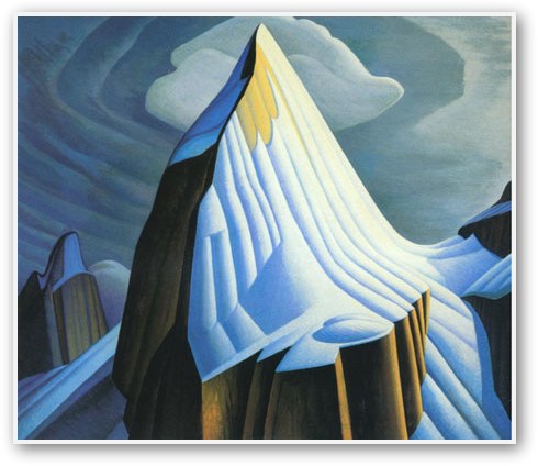

Lawren Harris
Mount Lefroy
.jpg)
I like the way Lawren used her colours in large strips rather than mixing them alot. Though she did mix colours together to create a sense of depth she still allows there to be strips of large paint which is very different, but also interesting.


Lawren Harris
Maligne Lake Jasper Park
I appreciate Lawren Harris' use of the depth in this painting. We can really see that the water goes very far off into the distance because of the mountains and how the mountains have a more lighter colour as they recede. There are also noticeable paint strips in this painting.
I appreciate Monet's use of colour in this painting. Even though the whole painting is generally green and blue, it really sends the viewer the message that the lily pond is full of vegetation. The choice of colour also does not confuse the viewer because of the difference of value of green in the painting.
Claude Monet, "The Grand Canal, Venice"
I like how Claude Monet uses his brush strokes to make the water seem like its moving constantly. Also the reflection of the various warm colours in the water makes the painting more interesting and it brings the painting together since there are some of the same colours on the buildings.


